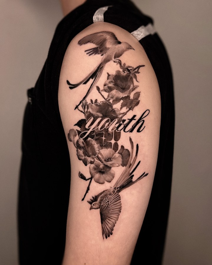
Colour realism
Realism made with colour. How it sits against your skin tone is the first thing I look at.
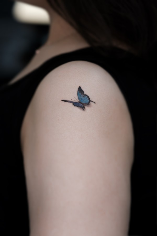
Partial colour keeps black and grey underneath and lays colour only where it is needed. Unlike full colour the places it goes are fixed, which suits a piece with one clear thing to emphasise. At Studio Goun it is most often used to put colour into part of a flower or a symbol.
Colour does not get better the more of it there is. Half the job is deciding where not to put it.
So the first question at the consultation is "in this image, where should the eye go first?"
Use colour on that one place and the remaining black and grey falls back like a background, and the contrast appears.
A single layer of petals, one line of ribbon, one iris — small areas do the most.
One piece of mine is a butterfly over a scar with colour laid into it. It is the only coloured photograph in the gallery on this site.
There is one more stage, so it takes longer. The black work is finished first, then the colour goes on and the edges are tidied.
Colour lightens more readily than black over the years. I say so at the first consultation.
Sunlight fades colour more than anything else. Once it has healed, sunscreen before you go out helps it last.
The same ink reads differently on different skin tones. We look at that together when the colour is chosen.
I work by appointment only, in a private studio in Hongdae. Where the colour goes is settled at the design stage.